Simple Way to Analyze Complex Data Online

Quickly transform complex data into meaningful insights with its drag-and-drop interface and advanced features. Learn about solution that is ideal for both developers and business users.
Read more

More Articles

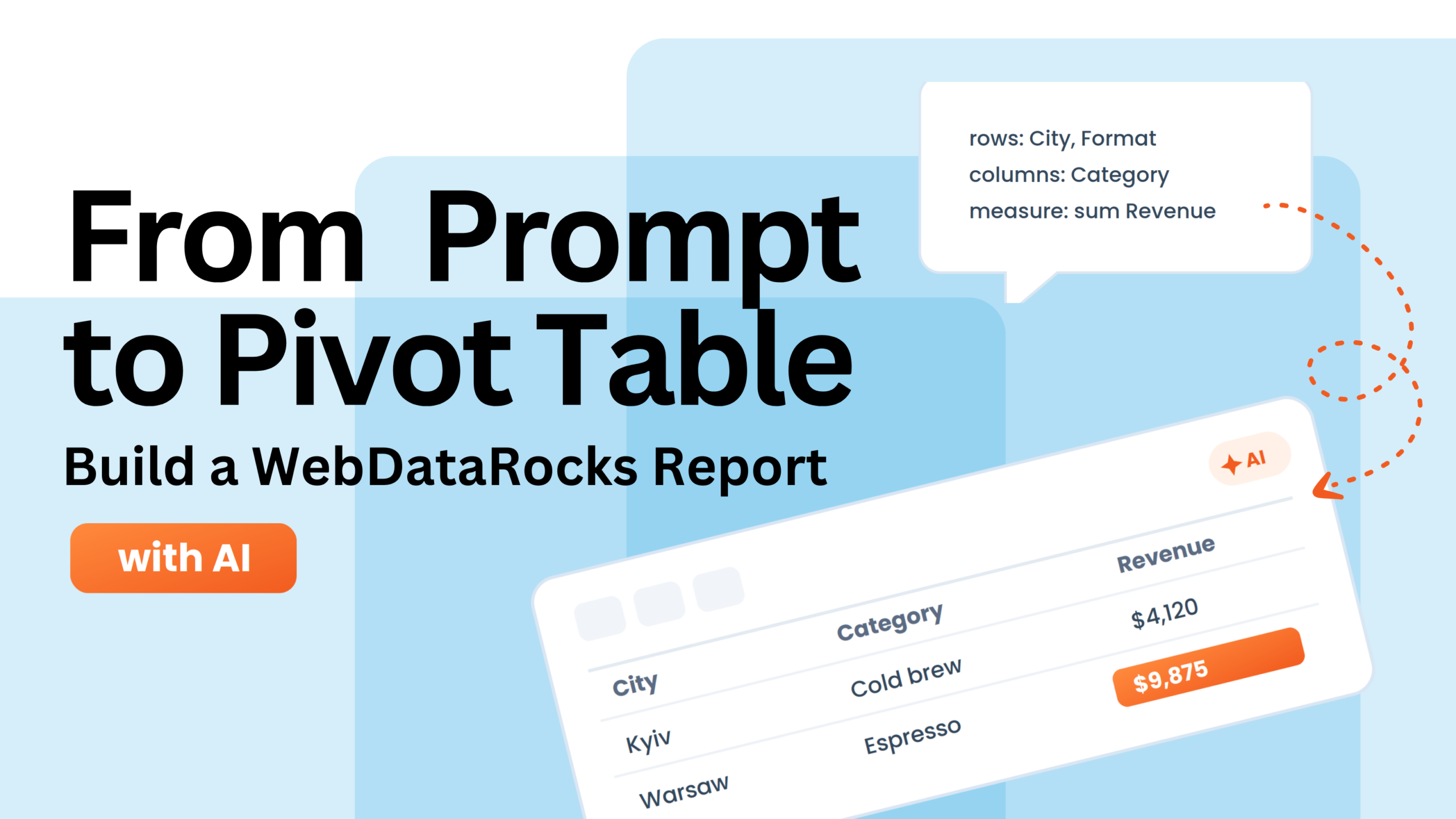
From Prompt to Pivot Table

Prompt-to-Pivot: Building WebDataRocks Report Inside Claude

We’ll show you how to go from a simple prompt to a working WebDataRocks pivot table, exploring different layouts, calculated values, formatting, and themes — all without setting up a project first.

Article thumbnail

5 Tips on How to Visualize Data for Insightful Solutions

The article discusses how visual data representation can improve problem-solving by making complex information easier to understand. It offers practical tips on using tools like charts and infographics to simplify data and enhance decision-making.

Article thumbnail

Charts for Comparison Over Time

It’s time to discover charts for one of the most common types of data analysis – a comparison over time.

PivotTable.js and WebDataRocks Comparison Cover

Updating Your Tech Stack: Migrating from PivotTable.js to alternatives

We compare PivotTable.js and WebDataRocks, highlighting their key differences to help you choose the right JavaScript pivot table solution.

Article thumbnail

How to Choose Charts to Show Data Composition

From stacked charts that show changes over time to pie charts that highlight proportions, we’ll guide you through the best options. Discover how to use visuals to tell your data’s story effectively.

Article thumbnail

Best Charts for Data Distribution

Let’s dive into the world of data visualization! Today, we’re unraveling the secrets of histograms and box plots – two powerful tools for understanding data distributions.

Article thumbnail

List of best JavaScript components for report application

Explore the best JavaScript components for building robust report applications. This article covers top libraries like Chart.js, amCharts, Apache ECharts, D3.js, and more, comparing their features, pros, and cons to help you find the right data visualization and reporting tools for your business needs.

Article thumbnail

Best Charts to Show Discrete Data

We explore the world of discrete data and show how to bring it to life through captivating visuals. You’ll discover a range of chart types, including bar charts, stacked bars, column charts, and more.

Article thumbnail

Top data visualization blogs to follow in 2025

Learn how to turn data into captivating stories with these top-rated data visualization blogs. This article offers a variety of resources to improve your data visualization skills in 2023.

Transform McDonald’s Dataset into Interactive Web Report. Inspired by #CodepenChallenge

Learn how to filter a large amount of data before loading, switch between layouts, and apply custom design using JavaScript and CSS. And all of that on a tasty, real-world example everyone knows: the McDonald’s menu.