
Tutorial: How to create a dashboard with WebDataRocks and AnyChart
In this article
In this article you’ll see how to create an interactive data dashboard using WebDataRocks and AnyChart. It covers collecting and preparing data, creating a pivot table with WebDataRocks, and creating charts with AnyChart.
Do you think building interactive data dashboards is difficult?
We’ll prove exactly the opposite by walking you through the concept to a stunning dashboard creation with the help of WebDataRocks and AnyChart.
What is WebDataRocks Pivot Table?
It’s a free JavaScript pivot table component that is compatible with all popular frameworks, server-side technologies, and other data visualization libraries. Being easy to set up, it provides all reporting features at hand – aggregating, filtering, sorting, and exporting to PDF, CSV, or Excel. Once you’ve connected to the data source, you can start getting meaningful insights.
What is AnyChart?
AnyChart is a JavaScript charting library that is easy to embed into any app. A lot of companies all around the world use its charts for the data visualization layer of their projects. Its API properties and methods allow for defining the custom appearance and behavior of charts.
Another thing we’d like to highlight is its rich gallery of ready-to-use samples and the Chartopedia guide, where you can learn about the structure and purpose of all chart types.
What do you get after completing this tutorial?
A responsive business dashboard that can be embedded in any project. The pivot table aggregates the data while the charting library turns it into intelligible visualizations.
Required technical skills
This tutorial presumes you are well familiar with JavaScript, HTML, and CSS. For starters, this will be enough to create the following dashboard, as we will guide through all of the process.
Alright, let’s get started!
Collect your data
The first and foremost step we need to take is to retrieve the data from available data sources and save it in a single CSV or JSON file. Make sure the data is cleaned and standardized. On top of that, data should be complete and accurate. Otherwise, we may end up with misleading results of data analysis. Learn more about JSON and CSV formats supported in WebDataRocks.
Define goals and your target audience
Before moving to practice, an important step is to identify the goals of your data analysis and ask the questions we want to get answers for.
Let’s imagine we work in a retail company that needs to analyze its annual profit by months, countries, and product categories. To satisfy its reporting needs, we need to implement a simple BI solution that shows critical metrics.
Install WebDataRocks
Now it’s time to set up your reporting tool.
There are three ways to carry this out.
- Download a package and add its files to your project.
- Add WebDataRocks scripts and styles to the
<head>section of your page.<link href="https://cdn.webdatarocks.com/latest/webdatarocks.min.css" rel="stylesheet"> <script src="https://cdn.webdatarocks.com/latest/webdatarocks.toolbar.min.js"></script> <script src="https://cdn.webdatarocks.com/latest/webdatarocks.js"></script>
- Install WebDataRocks via npm.
npm install @webdatarocks/webdatarocks
Additionally, you can add styles of report themes to prettify your component.
If you need more details, please refer to the Quick start guide.
Create a Pivot Table
Add the container where the pivot table should be rendered:
<div id="pivot-container"></div>
Embed the component in it using new WebDataRocks() API call:
var pivot = new WebDataRocks({
    container: "#pivot-container",
    toolbar: true,
    report: {
        dataSource: {}
    }
});
Now we need to tell the component from where to catch the data.
We have at least two ways of doing it:
- Specify the link to the CSV/JSON dataset.
dataSource: { filename: "URL-to-data" } - Set the name of the function that returns the JSON data.
dataSource: {
    data: getData()
}
Build a report
The pivot table component is filled with the data. Let’s start exploring it!
Firstly, we need to organize the data on the grid so that it is comprehensible for the end-users. To achieve this, we define which hierarchies we want to see in the rows and columns as well as measures that should be at the center of attention.
Here is a sample of the slice object that describes a subset of the data:
"slice": {
        "rows": [
            {
                "uniqueName": "Country"
            }
        ],
        "columns": [
            {
                "uniqueName": "Product Category"
            },
            {
                "uniqueName": "Measures"
            }
        ],
        "measures": [
            {
                "uniqueName": "Profit",
                "aggregation": "sum"
            }
        ]
    }
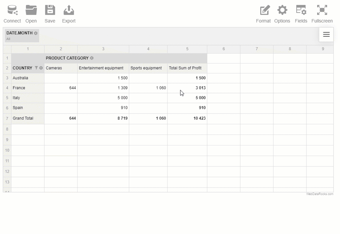
This particular slice answers the following question: “How much profit did each country bring?”
If we sort the data, we’ll discover which country brought the most/least profit. Also, it’s possible to filter the data and create calculated values to measure custom metrics.
Note that we can change this slice anytime to get a different view of the data and answer other questions. This is what makes this tool so flexible.
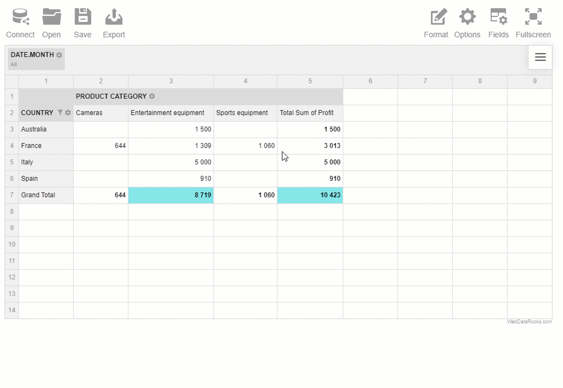
Highlighting report metrics
To draw attention to the most important values, we can apply conditional formatting to the cells.
We can format the numbers tidily via the UI as well:
Save the report
Save the tabular report in a JSON file to be able to pick up where you left off later.
Install AnyChart
To get access to charts, we need to add the script file to the <head> section of the page:
<script src="https://cdn.anychart.com/releases/8.6.0/js/anychart-base.min.js" type="text/javascript"></script>
And a container where the chart should be rendered:
<div id="chartContainer"></div>
Process the data
The next step is to transform the data into the format that is suitable for the chart type we are going to use.
Our goal is to write a code which does the following:
- Retrieves the data from the pivot table.
- Processes the data to the appropriate structure.
- Sends this data to the newly created chart.
- Sends updated data to the existing chart if the grid’s report is changed.
But how do we find out when the pivot table is ready to provide the data?
This is where reportcomplete event comes in handy. It’s triggered once the pivot table is rendered and ready to show the report.
Let’s attach an event handler to it and create the function that implements the above-mentioned scenario.
reportcomplete: function() {
    pivot.off("reportcomplete");
    createPieChart();
}
In createPieChart(), we use webdatarocks.getData() method to request the data from the specified slice and pass it to callbackHandler and updateHandler. callbackHandler defines what should happen as soon as the pivot component is created and the data is ready to be passed. It accepts one argument – a rawData object which has to be processed for the selected type of chart. You can do it by implementing an additional function (e.g. prepareDataFunction()). After the data is prepared, we initialize the chart and fill it with this data.
updateHandler is called once some change occurs in the report (the data is updated/sorted/filtered). We’ll use it for updating the chart’s data at change.
To keep the tutorial brief and simple, we don’t include all code here – please refer to this demo. There you’ll also see how to implement prepareDataFunction().
Results
It’s time to enjoy the results of your great work!

You are ready to use an interactive data dashboard that can assist as a BI tool and provides insights into the levels of profits of a particular company. It looks simple yet it’s very effective when it comes to decision-making.
We encourage you to experiment – change the slice interactively, drill through the values to see which records are hidden behind.
Check out the CodePen demo!
Wrapping it all up
In this tutorial, we learned how to set up a dashboard in your app using JavaScript and two free data visualization libraries that perfectly complement each other – WebDataRocks and AnyChart. We do hope these tools will make a positive impact on decision-making in your business.
Dive deeper
If you have any questions about the structure of a rawData object returned by getData(), please refer to this article.
If you are interested in creating multilevel hierarchies, check out our guide.
In case of any other questions related to WebDataRocks functionality, please post them on StackOverflow.
Do you have a React, Vue or Angular app? Read our available tutorials on integrations.
What else to read?
- Data visualization with WebDataRocks & Chart.js: create a dashboard in 5 min
- Pivot Tables: The Ultimate Guide
- List of best JavaScript components for report application
- Online Reporting: Top Free web-based Pivot Grids that developers will love
- Best Charts to Show Discrete Data


