Prototyping WebDataRocks Report in ChatGPT
In this article
Discover how ChatGPT can help you prototype a WebDataRocks report, experiment with different layouts, and turn plain-English requests into interactive data reports
AI develops and grows really fast nowadays, and the good news is that you can use it to your advantage when working with WebDataRocks. More precisely, you can build a working pivot table in ChatGPT before you’ve opened a single project file. The catch isn’t the pivot table library — WebDataRocks is light enough that describing a report in plain English gets you a working grid in one message. The catch is a handful of small, predictable things that go wrong if you don’t know they’re coming.
This article covers everything you need to know to get started with WebDataRocks in ChatGPT, using an online bookstore’s sales data as a practical example.
Before we start, we have a step-by-step tutorial on using Claude with WebDataRocks. If you’re interested in this topic, we highly recommend checking it out here.
Use jsDelivr for a smoother Canvas experience
If you’ve already been scrolling through our docs, you’ve probably noticed that WebDataRocks’ documentation points to cdn.webdatarocks.com. When you use that URL in a ChatGPT Canvas prompt, the preview may stay blank because Canvas previews run in a sandbox, and their access to external web resources can be restricted.
In our testing, loading WebDataRocks via jsDelivr is more reliable in the Canvas preview. So, instead of using the URL from the documentation, tell ChatGPT to load the same files from jsDelivr:
Load the CSS from "https://cdn.jsdelivr.net/npm/webdatarocks/webdatarocks.min.css" and the script from "https://cdn.jsdelivr.net/npm/webdatarocks/webdatarocks.js".
Getting a working table in one message
Fields, layout, and measure in one prompt, rather than the library first and the report shape as a follow-up:
Build an interactive WebDataRocks pivot table. Load the CSS from "https://cdn.jsdelivr.net/npm/webdatarocks/webdatarocks.min.css" and the script from "https://cdn.jsdelivr.net/npm/webdatarocks/webdatarocks.js".

Generate 100 records of online bookstore sales as a JSON array with fields: Genre, Format (Print, Ebook, Audiobook), City, Units Sold, Revenue in USD, Month.

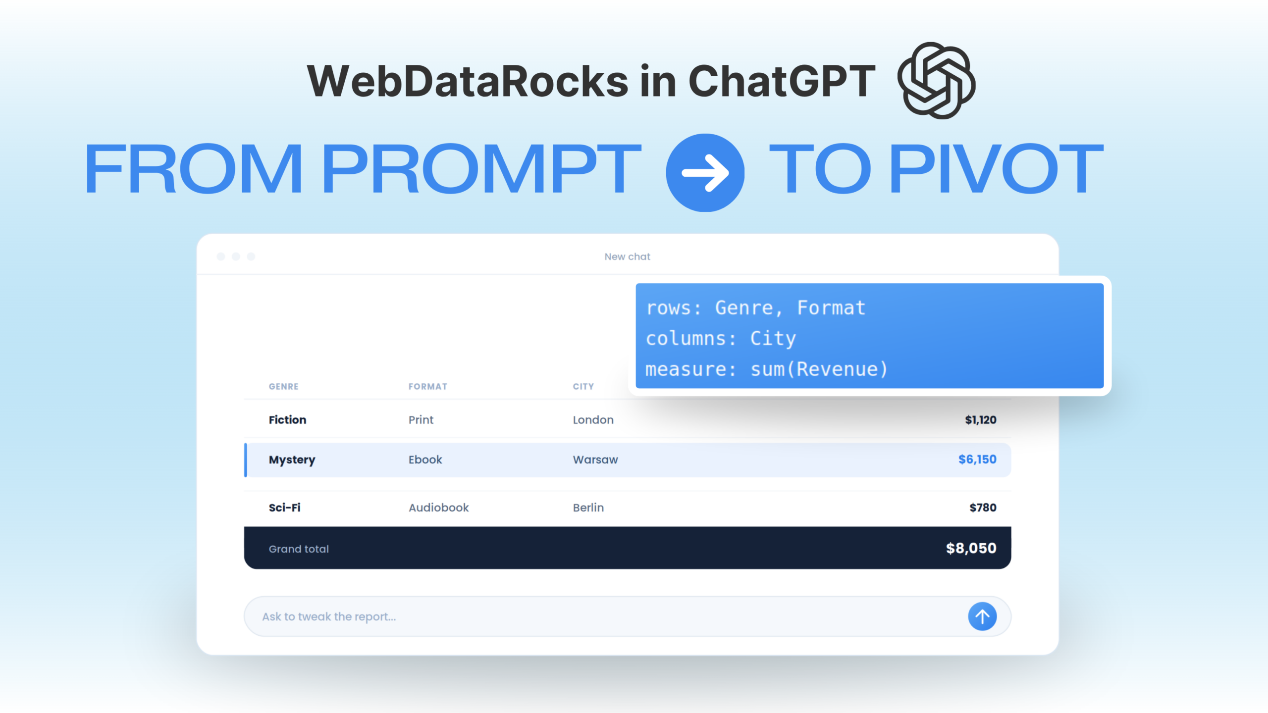
Configure the report: rows = Genre, Format; columns = City; measure = sum of Revenue. Enable the toolbar. Set the container height to 500px.

Vague phrasing gets you a vague report
Important to mention that there’s a real gap between prompts that sound similar but land differently. “Show revenue by genre and city” is the kind of line people type first — and it usually gets you a table, just not one with a defined row/column split, so half the time you end up with everything crammed into rows and no columns at all.
Compare:
Weak: "Show me revenue by genre and city."
Works: "Rows = Genre. Columns = City. Measure = sum of Revenue."
The difference is that the second version maps directly onto WebDataRocks’ report object — rows, columns, and measures are named fields in that config, not just descriptions of intent. Say it the way the library thinks about it, and ChatGPT doesn’t have to guess which axis you meant.
Changing the slice without losing the data
Ask for a “new pivot table” to see a different angle, and ChatGPT will regenerate the underlying records and layout — so your before-and-after screenshots will no longer be comparable. Ask for an edit instead:
Update the pivot table you just generated. Keep everything exactly the same. Only change the report layout to:

Rows: Format, then Genre
Columns: Month
Move City to the report filter
Measure stays Revenue, sum aggregation

Give me the complete updated HTML.

Same 100 rows, new angle. “Update the existing report” is the phrase doing the work — use it every time.
Calculated fields without needing the syntax
Add a calculated value "Revenue per Unit" = Revenue / Units Sold, shown as currency with 2 decimals, as a second measure next to Revenue.

Format Revenue cells with a thousands separator and a "$" prefix. Highlight cells where Revenue is above $1,500 in bold green, and below $200 in red.

Describe the outcome, not the function name — ChatGPT maps it to WebDataRocks’ calculated value and conditional formatting options on its own.
Try it yourself
Now it’s time to experiment. Take the first prompt from this article, swap the fields for a dataset you actually work with, and see what ChatGPT can build. Then experiment with the report itself: you can do much more than described in this article. For example, try switching themes, applying conditional formatting, adding filters, sorting values, adding/deleting the toolbar, etc.
You can describe each change in plain English and see how ChatGPT translates it into a WebDataRocks report. If something doesn’t work as expected, try to refine your prompt.
WebDataRocks is free to experiment with, so there’s no real cost to trying different report ideas before you write any setup code.
Does this work with real data, not generated sample rows?
Yes. You can upload your own file to the chat and build the report with your data. Just keep in mind that large files can use a lot of tokens and take up the chat’s context, so it’s best to use a smaller dataset or trim unnecessary columns first. And don’t forget that WebDataRocks has a 1 MB file size limit. If you need to process a larger file, consider using Flexmonster Pivot Table instead.
Do I need to know the WebDataRocks API to do any of this?
No. Everything above is a plain-English description. Knowing the field names (rows, columns, measures, and report objects) helps ChatGPT understand you more quickly, but it’s not required.
What if the theme or layout I ask for doesn’t exist?
Asking for something outside WebDataRocks’ documented themes or layout options (“make it more minimal,” “add a sidebar”) often triggers a full regenerate instead of a small edit. Stick to named, documented options — dark theme, green theme, and so on.